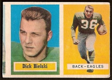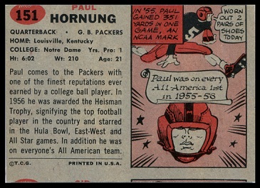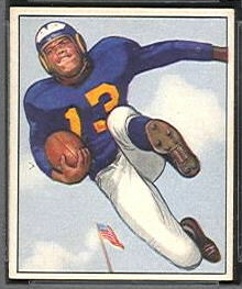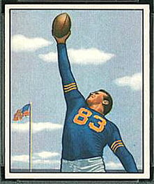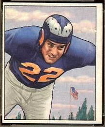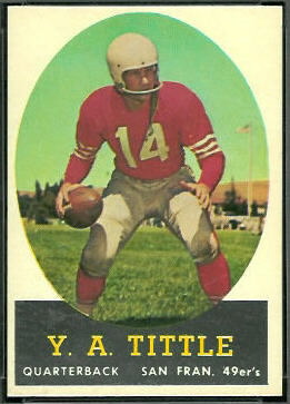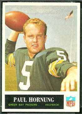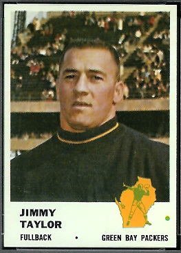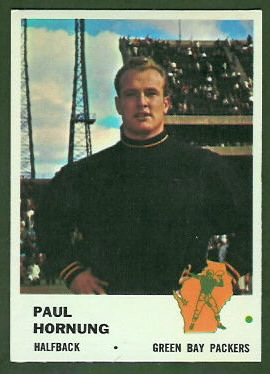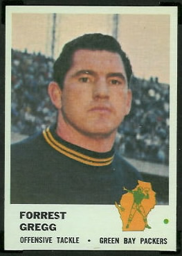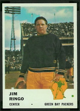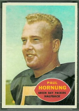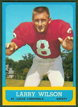


Topps produced a great variety of football cards in the 1960s: AFL cards and NFL cards, cards with natural backgrounds and cards with colored ones, cards oriented horizontally and cards oriented vertically, cards bordered by stars and cards that looked like little TVs, standard-sized cards and “tall boys.” A collector who focused on just 1960s Topps football cards could build a large, attractive, and interesting collection.


Topps had competition in the 1960s, and I attribute some of their creativity to that. The competition coincided with the emergence of the AFL: while the AFL and NFL competed for fans, the card companies aligned with the leagues and competed as well.
Fleer was the card company of the early AFL. From 1960 to 1963, Fleer produced three AFL-only sets and one AFL/NFL set. In the same time period, Topps produced three NFL sets and one AFL/NFL set. Both companies produced their combined AFL/NFL sets in 1961.
In 1964, Philadelphia Gum Company obtained the rights to print cards of NFL players, and they did so until 1967. Topps countered with AFL-only sets from 1964 to 1967.
In 1968, after the NFL and AFL agreed to merge, Topps obtained the rights to both leagues. By the early 1970s, without competition, Topps’s creativity began to wane. That rant is for a later post, though. This week we’ll look at Topps’s offerings from 1960 to 1963, the years they competed with Fleer.
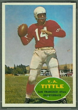
1960 Topps
 1960 Topps is my least favorite 60s Topps set, probably because it is less colorful than their later sets. I am not fond of the big footballs with the players’ names in them, either: they remind me of the big white footballs on 1953 Bowman cards. Though Topps evidently had the rights to use the teams’ logos, they put them only on the team cards, which is unfortunate. I do like that the images of the players cover most of the cards, unlike the peephole views on 1958 Topps cards.
The 1960 Topps set was printed on a single 132-card sheet. There is a virtual 1960 Topps sheet, and a few notes about the set, in the Vintage Football Card Gallery. One bit of trivia about the set is that three of the cards–Bill Wade, Doug Atkins, and Frank Varrichione–have reversed images. Another is that, to my knowledge, this was the first Topps set to contain inserts in the packs. The inserts were metallic stickers: novel, but homely.
1960 Topps was the first major set in which all cards from a given team were grouped together numerically. I always liked this feature. Topps continued the practice until 1968, then abandoned it. Coincidentally–or was it?–1968 was the year they no longer had competition.
Finally, the 1960 Topps set was the first in which the Dallas Cowboys appeared. The Cowboys joined the NFL in 1960. Doyle Nix is the only Cowboy in the 1960 Topps set who did not appear on an earlier card for a different team.
1961 Topps
 The 1961 Topps set was released in two series, the first containing NFL players, and the second containing AFL players. This is how Fleer released their 1961 set, as well. Though the price guides give higher values to the second series cards in both sets, the second series cards are in fact more plentiful than the first series cards. Be skeptical of your price guides.
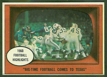
1961 Topps was the first set to contain action cards, like the Eddie LeBaron card shown here. Each action card was framed by a woodgrain TV, a precursor to the 1966 Topps cards. The 1961 Topps and Fleer sets were the first to contain Minnesota Vikings cards. The Vikings were an expansion team in 1961.
Oddly, most of the Houston Oilers in the 1961 Topps set are shown in pink jerseys, though their team color was powder blue. Only George Blanda was spared the pink treatment.
1962 Topps
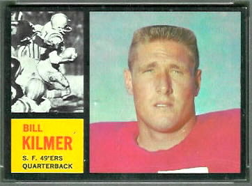
 I love the design of the 1962 Topps set. Each player card shows two images of the player: an above-the-waist still image, and a black-and-white inset photo of the player in action. Some of the inset photos show the wrong players, however. It turns out that Topps even altered some of the photos to give the impostors different numbers.
The 1962 Topps set is tough to assemble in high grade, because the black borders show wear easily. I think high grade is the only way to go, though, since even a little wear can make the cards look bad.
I have seen a few recolored cards from this set, where someone tried to touch up a corner or an edge with a black marker. You can often detect recoloring by looking at the edges of a card, because the ink from a black marker will bleed onto the edge.
Other than the unique design, I can’t think of any remarkable features of this set. The unique design is enough for me, though.
1963 Topps
 The 1963 Topps set is another tough one. Its colored borders are slightly more forgiving of wear than 1962’s black borders, but this is another set I would try to get in high grade.
There are a lot of short prints in the 1963 Topps set; they are marked in the Vintage Football Card Gallery. That tells only part of the story, though. Many of the short prints–in particular some of the Steelers and Redskins–are practically impossible to find well-centered. Most of the problem cards were on the edges of the sheets. You can see what the sheets looked like on my 1963 Topps virtual uncut sheet page.
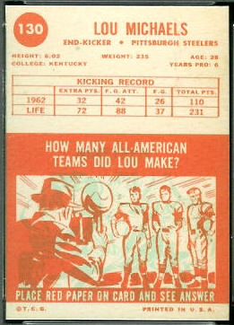
 There is one bit of innovation in the 1963 Topps set. The backs have questions with hidden answers, like some scratch-off cards. (See S is for Scratch-Offs.) You don’t scratch them to see the answers, though. Instead, you hold a piece of red cellophane over them. I used to have a bit of the red cellophane, which I assume came in a pack with the cards, but I can’t locate it now. I might never know the answers to these questions.
One last thing worth mentioning is that the backgrounds of many 1963 Topps cards vary in color: you can find them with either a blue sky or a purple one. There used to be a good article on geocities about the variations, but the article is no longer there. Someday maybe I’ll write about the variations myself. Until then, you can see the purple and blue variations of Willie Wood’s rookie card in one of my previous blog articles.
