Topps has printed football cards every year from 1955 to 2009, but since this is a vintage football card blog, I need to stop somewhere. Which years are considered vintage? There is no official definition, but most collectors put the end of the vintage era between 1970 and 1975. As a kid, I collected cards until 1973, so that’s where I’ll stop with this article.
1970 Topps
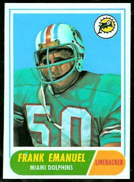
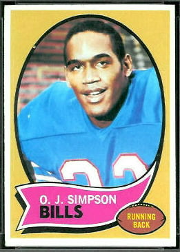 The 1970 Topps football set is the only set I completed as a kid. I’m not nostalgic about it. Looking at all of the football sets that preceded it–Topps and otherwise–I think the 1970 Topps set is drab. As in 1958 and 1967, Topps used a portrait style on their 1970 cards, and the “matting” covers a large portion of the images. Also, starting in 1970, Topps no longer had the rights to print team logos on cards. In 1968 and 1969, Topps used the team logos to dress up the cards, but in 1970 the logos were gone. Not only that, but in 1970, Topps used only player photos that did not include helmets, in order to avoid showing the team logos on them. Sets prior to 1970 included a lot of nice photos of players with their helmets, but starting in 1970, if Topps showed a helmet on a card, they had to airbrush its logo away.
Like the 1969 Topps set, the 1970 Topps set was released in two series of 132 cards. Card #132, the second series checklist, was included in both series, so it is a double print. As in the 1969 set, some of the second series 1970 cards have scratch-off backs. As in 1969, most of them went unscratched. (See S is for Scratch-Offs.)
Though I’m not fond of the set, there was one great thing about it: every second series pack included a Super Glossy insert card. The 1970 Topps Super Glossies are easily my favorite insert set, and perhaps my favorite set overall.
1971 Topps
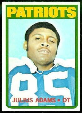
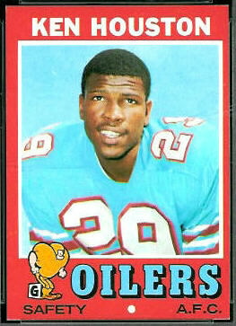 1971 Topps is my favorite regular 1970s set. The colored borders on the 1971 Topps cards make them brighter than the other 70s Topps cards, and also more challenging to find in high grade. (Cards of AFC players have red borders; cards of NFC players have blue ones.) The cards don’t have team logos on them, but the little cartoon football players on the front are kind of fun. There’s a different cartoon player for each position.
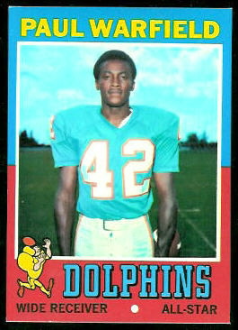 The 1971 Topps set was the first set to acknowledge the players that were All-Pros the previous season. The All-Pros’ cards have borders that are half blue and half red, like the Paul Warfield card shown here. The 1971 Topps set was another 263-card set released in two series, and its second series checklist appeared in the first series, as well.
It is in the 1971 Topps set that we see the first airbrushed helmets. Though the set doesn’t include any “in action” cards labeled as such, three of the regular cards–Joe Kapp, Jake Scott, and Dennis Shaw–show images of the players in action, and the logos on their helmets have been airbrushed away. This was the start of a dreadful practice.
1972 Topps
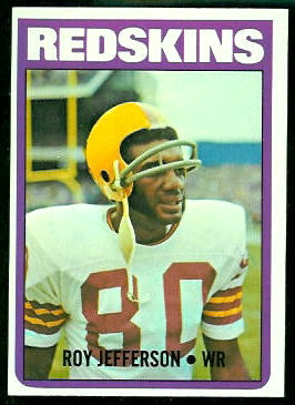
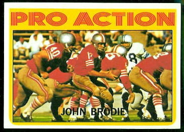
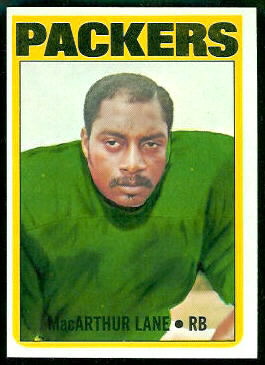
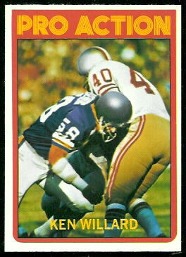
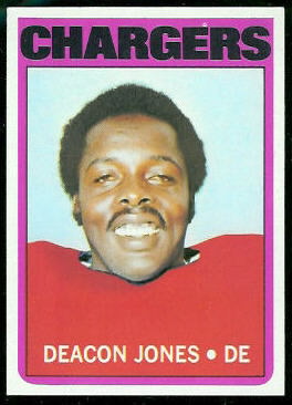
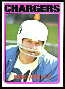
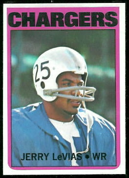
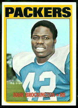
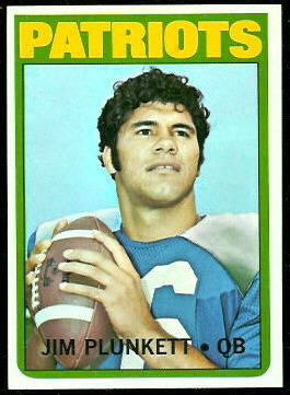
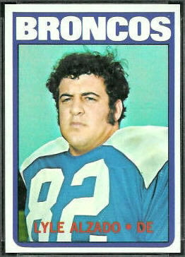
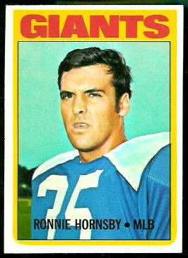
 In 1972, Topps fully embraced airbrushing. The 1972 set included 42 “Pro Action” cards, and the helmets on those had to be airbrushed. Topps also used sideline photos for a few players, and they had to airbrush the helmets on those, as well. While they were at it, if a player had been traded to a different team, Topps just airbrushed an old photo to give him new colors. Why bother getting a new photo when you can just airbrush an old one?
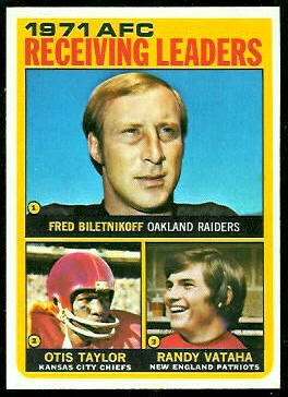
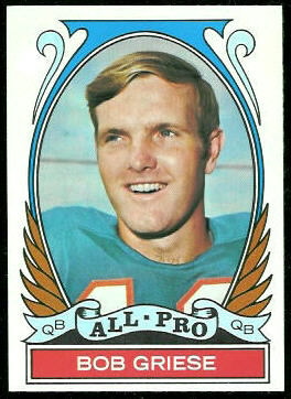
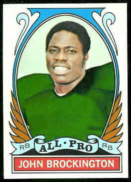
 The 1972 Topps set did have some firsts: it was the first to include “league leaders” cards, and it was the first to include cards for the previous year’s playoff games. Both of those are nice features. It was also the first to give All-Pro players both a regular card and an All-Pro card–overkill, if you ask me. Some star players–Floyd Little, for example–appear on four cards: regular, All-Pro, league leaders, and Pro Action.
 This set was also the first–and, to my knowledge, only–football set to be released in three series. The third series appears to have been an afterthought. Why do I think this? Well, the first two 1972 series had a total of 263 cards, like the full 1969, 1970, and 1971 sets. The second series checklists from those sets appeared in both the first and second series, and so did the 1972 second series checklist. If Topps had planned a third series in 1972, wouldn’t they have continued this pattern and included a third series checklist in the second series? Also, 38 of the 88 third series cards are All-Pro and Pro Action cards, basically fillers. The remaining 50 cards are player cards, and though a few are Hall of Famers, none of them are major stars. The biggest names of the day–Unitas, Sayers, Simpson, Bradshaw, Namath, Staubach, Butkus, Griese, and Dawson–are all in the first or second series. And none of the league leaders who appear on cards 1 through 8 are among the player cards in the third series.
 The third series was also released very late in 1972. I know I had lost interest in cards by the time they came out, because the only third series cards I had in my childhood collection were from a pack my brother gave me for Christmas. Evidently not many other kids bought the third series cards, either, because when I resumed collecting in 1989, they were scarce and worth much more than cards from the first two series. Larry Fritsch Cards apparently bought a lot of unopened third series cards, though, and as Fritsch has been selling them, the prices have fallen. Not only have a lot of third series cards entered the market recently, but they’ve all been brand new! Fritsch still has unopened boxes of 1972 Topps third series cards for sale.
1973 Topps
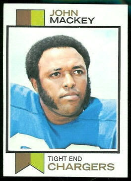
 In 1973, Topps went to the other extreme and released all of their football cards in a single series. If the modern era is defined by large sets released in a single series, then 1973 is the beginning of the modern era for football cards. Topps was now clearly going for quantity over quality: there are 528 cards in the 1973 Topps set, and they are the plainest of the plain. Gone are any nice touches, even simple things like using the team’s colors in the little ribbon on the left side of the cards. Topps did, at least, use the same ribbon colors for all of the players on the same team. All St. Louis Cardinals cards, for example, have blue-and-orange ribbons.
Surprisingly, though Topps dramatically increased the number of cards in their set in 1973, they omitted some of the special cards they introduced in 1972. Like the 1972 set, the 1973 Topps set contains league leader cards and cards of the previous year’s playoff games, but it does not include Pro Action or All-Pro cards. The 1973 set does include three funky boyhood picture cards, but the bulk of the set is player cards. The large increase in the number of player cards meant that a lot of players made their first appearance on a card in 1973. I might be off by a card or two, but I count 196 rookie cards in the 1973 set! To me, the number of new faces is the set’s best feature.
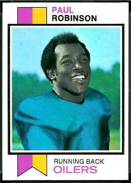
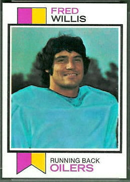
Of course, it wouldn’t be a 70s set without some serious airbrushing. Here are a couple of beauties. The Paul Robinson card looks like a face-in-hole picture.


As I said at the top, 1973 was the last year I collected cards as a kid. Coincidentally, that’s about the end of what most collectors consider the vintage era. It’s also when Topps appeared to go into full cost control mode. By 1973, Topps was using the sparest of designs, they evidently chose not to spend money to license team logos, and they crudely airbrushed old photos of players rather than acquiring new ones. If I remember correctly, they did not include inserts in packs of 1973 cards, either.
I presume that with no competition, the company was just minimizing costs to maximize profits. Or, maybe, because inflation was high in the 70s, they were trying to reduce costs so they could keep prices low. Their customers–kids like me–didn’t care much what the cards looked like, so long as our favorite players were on them. Now, though, as vintage card collectors, we have dozens of old sets to choose from, and I prefer most 50s and 60s cards to those from the 70s.
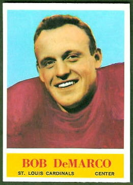 Whenever I see a copy of Bob DeMarco’s 1964 Philadelphia football card, I am puzzled. The image on the card was obviously airbrushed, but I don’t know why the card company would have airbrushed it. DeMarco had been with the Cardinals since his rookie season, 1961, so they wouldn’t have needed to change him out of another NFL team’s colors.


 The 1971 Topps set was the first set to acknowledge the players that were All-Pros the previous season. The All-Pros’ cards have borders that are half blue and half red, like the Paul Warfield card shown here. The 1971 Topps set was another 263-card set released in two series, and its second series checklist appeared in the first series, as well.