T is for Topps, Part 3: 1964-1969
February 12th, 2010 | Published in ABCs of Vintage Football Cards
 In 1964, the Philadelphia Gum Company obtained the rights to print cards of NFL players, and they did so from 1964 to 1967. (See P is for Philadelphia.) For those four years, Topps switched to printing cards of AFL players. The cards that the two companies produced reflected the images of the leagues: Philadelphia’s NFL cards were conservative and consistent, and Topps’s AFL cards were colorful and innnovative.
In 1968, after the NFL and AFL agreed to merge, Topps obtained the rights to both leagues, and Philadelphia stopped printing football cards. Topps closed out the decade with two colorful sets containing both NFL and AFL players.
1964 Topps
The 1964 Topps set contains 176 cards, a large number for only eight AFL teams. 166 are cards of individual players (the others are team cards and checklists), so there are 20 or 21 player cards for each team. At the time, that was about twice the usual number of players per team, so Topps was able to include more cards of non-stars than usual. Give or take a card or two, there are 73 rookie cards in the set! Among the rookie cards are these bookend Hall of Famers, Bobby Bell and Buck Buchanan of the Kansas City Chiefs.
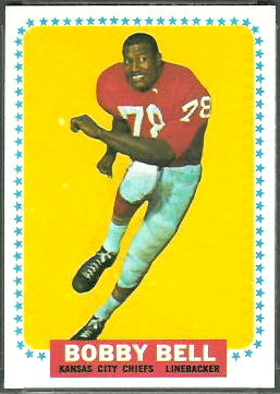
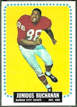
The 1964 Topps cards have colored backgrounds and colored stars around the borders. I don’t see a pattern to the colors Topps chose for the backgrounds, except that each card has a background color different from the player’s jersey color. Most of the cards have the player’s name, position, and team in white letters on a black background, but a handful–such as the Bobby Bell card–have either white-on-blue or white-and-black-on-red labels. If there is any significance to the alternate label colors, I don’t see it.
The 176 cards in the 1964 set would have been printed on two 132-card sheets, with 88 cards repeated. That means that there are either 88 double prints or 88 short prints in the set, depending on whether your glass is half-full or half-empty.
There is one mistaken identity in the 1964 Topps set: Ray Abruzzese’s card actually pictures Ed Rutkowski. Topps evidently was focused on spelling his name correctly.
1965 Topps
I described the classic 1965 Topps set in J is for Joe Namath–and the 1965 Topps Tall Boys, so I won’t cover it again here. On to 1966…
1966 Topps
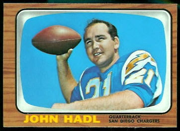 In 1966, Topps used the “little television” design previously seen on 1955 Bowman baseball cards and on the highlight cards in the 1961 Topps football set. I imagine that by the third time around, it had lost its cuteness. (I noticed today that even the checklists in the 1966 Topps set are in the shape of TVs.)
Though the Dolphins joined the AFL in 1966 and were included in this set, Topps reduced the set size to 132 cards. They also wasted one on the Funny Ring Checklist. Because of the reduced set size, there are only 13 rookie cards in the set, and there are no Hall of Famers among the rookie cards. I’d call the set a letdown after 1965.
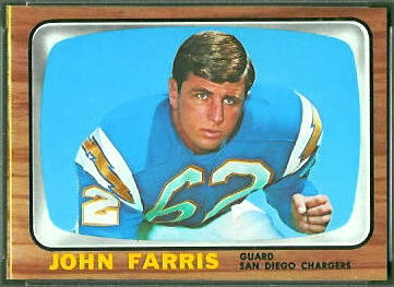 So, what’s interesting about the 1966 Topps cards? Well, the brown borders show wear easily, so finding high-grade cards is a challenge, and challenges are always fun. Also, some cards, such as the John Farris card shown here, can be found with a stripe along one edge. (I’ve seen yellow, red, and black stripes.) The stripes don’t seem to affect the grades that PSA assigns the cards, but to me they’re distracting, and I prefer cards without them. I presume that cards with a stripe were on the edge of the sheet, but I have not seen an uncut sheet to verify that.
Since the set fit perfectly on a 132-card sheet, none of the cards are short prints. The backs of some cards are white, and the backs of others have a yellowish-brownish tone, suggesting that some sheets were printed on different paper stock than others. Here again, I prefer cards with white backs to those with toning, but PSA does not appear to discriminate.
1967 Topps
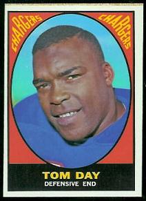
In 1967, Topps returned to bright colors, and 1967 Topps football cards resemble some of the psychedelic art of the time. (The Peace poster shown here is from cafepress.com.) This is another 132-card set with no short prints, no Hall of Fame rookie cards, and no real oddities. I think, though, that it captures the spirit of the AFL and the country better than any of the other 60s sets.
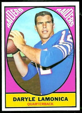

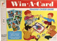
As I wrote in an earlier article, 33 of the 1967 Topps football cards were reprinted in 1969 for a Milton Bradley game called Win-A-Card. The backs of the Milton Bradley cards have a slightly lighter color than the regular cards (yellow v. orange), and some of them, along their borders, show parts of other cards that were included in the game–such as 1968 Topps baseball cards.
1968 Topps and 1969 Topps
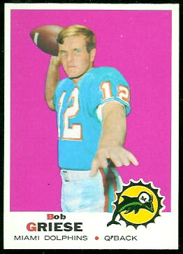
As I said at the top, the 1968 Topps and 1969 Topps sets contain both NFL and AFL players. Topps made these sets bigger to accommodate the larger number of teams, and it released each set in two series. Like most of the Topps cards of the 60s, the 1968 and 1969 sets are colorful and bright.
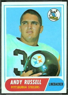
For more detailed information on these sets, see my virtual uncut sheet pages. Here are the links:
More of the ABCs:
